Seamless Android app launch animations using Intent Source Bounds
The title of this article refers to Android Intent class’ field mSourceBounds. Surprisingly the documentation for this field is sparse and I have not seen many apps taking advantage of this field. In this article, I will attempt to decode the intention (pun intended) behind Source Bounds and provide ways it can be used in context of animations.
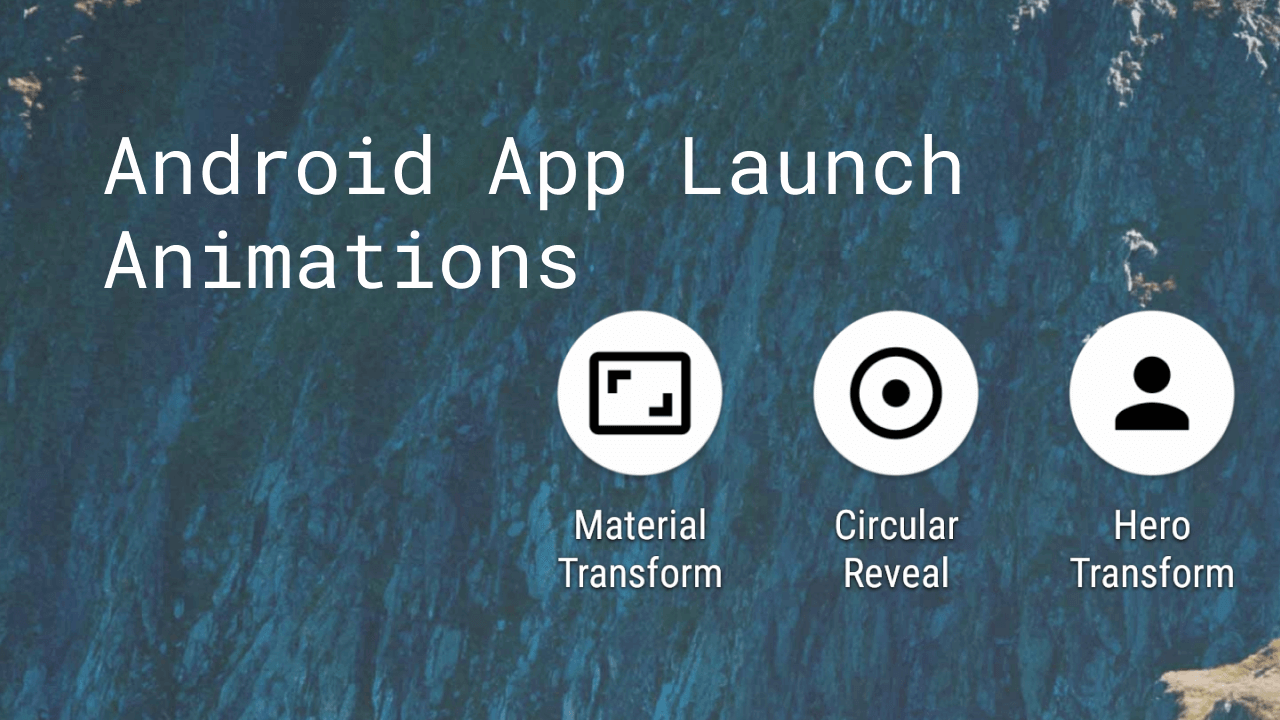
What we will build:
Intent.mSourceBounds
As per documentation, source bounds is way for app developers to hint to the receiver of the Intent where the intent is originating from by defining a Rect.
/**
 * Get the bounds of the sender of this intent, in screen coordinates. This can be
 * used as a hint to the receiver for animations and the like.  Null means that there
 * is no source bounds.
 */
 public @Nullable Rect getSourceBounds() {
   return mSourceBounds;
 }
By using the provided Rect, the receiver can prepare for showing its content and animations are great way to prepare content entry. Before we delve into details of what’s possible with this field, let’s discuss few examples
- A photo gallery app could use the field to hint the
Photolocation in a grid andPhotoDetailscreen could use that to animate in the full image from origin in previous screen. - User clicks on a button that launches a new activity. The new activity could originate from where the button was placed.
Astute readers might already made have comparison to Shared Element Transition framework which already does the above things for us. Is it not? Not exactly.
The shared element transition is better used for things that are shared between two screens. In the first example, Photo in grid and detail screens are the same contextually, whereas in the second example, the button only serves as a hint for the next activity to load. The loaded activity might not contain the button element at all. In cases like this, we just want to hint the originating location and that is where SourceBounds come in. Moreover, shared element transitions are confined to your app and typically not run when launched by external app eg: launched by launcher app.
Specification
- Source bounds
Rectis defined relative to screen coordinates. - Since it is part of
Intentit can be accessed from anyActivityby callingintent.sourceBounds. - When receiving external
Intents, it is upto to the caller to specify the source bounds so there is a possibility the source bounds could be wrong/invalid. - Source bounds can be
null.
Android Launchers
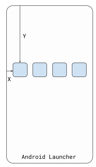
Like any development work, I set out to find any exsiting usage of this API to understand its usage. Turns out, there are few references in Android repository. One particular reference that caught my interest was its usage in Android Launcher3 codebase. Basically whenever any app is launched by the Launcher, it attaches the source bounds in the Intent that is fired. The source bounds point to the icon location screen in both home screen or the app drawer whichever was used to launch the app. This essentially means Android apps can infer where the app icon is on home screen.

With this information - bounds of icon on home screen, it becomes easy to add delightful animations to onboard users to your Android app. In the remainder of the article, we will discuss few ways to utlize this field.
Animations
For app entry animations, it is important to understand existing behaviors that might cause unpleasant experiences for the end user.
- Android Launcher already executes an app launch animation which can conflict with custom animations
- Android
WindowManagercontrols the root layout’s bounds, background and visibility. Custom animation code should be wary of this and prepare accordingly. Source Boundscompletely depends on the caller and it is possible it has wrong information.Source Boundscan be missing and app should be prepared to run without animations
To overcome 1, we can user overridePendingTransition just before super.onCreate(savedInstanceState) to override the animation set by Launcher. For 2, there are ways to override/controle WindowManager behavior, but I chose to keep this example simple. One property, we must overriding is the Window background which can be defined in styles.xml like below:
 <style name="AppTheme.NoWindowBackground" parent="AppTheme.NoActionBar">
        <item name="android:windowBackground">@android:color/transparent</item>
        <item name="android:windowIsTranslucent">true</item>
</style>
These properties allows us to have a transparent space where we can run our animations and it would appear like it is part of the launcher due to transparency.
For 3, one possible way to check it simply check in the bounds are within our desired area. If we are having a hero image on screen, we could simple check heroBounds.contains(sourceBounds).
In the 3 upcoming examples, we would require the steps above so I added these Kotlin extensions to avoid repeated code and avoided inheritance. The code should be self explanatory.
Circular Reveal Animation
In circular reveal sample, we will try to reveal the content of our app from the home screen icon location in a circular way just like what Lollipop introduced. To perform circular reveal:
- Find the relative center point
(centerX, centerY)on our root layout which corresponds to icon on our home screen. Since source bounds correspond to screen coordinates, we should find the Rect for our concernedViewi.e root layout. Then we simply dosourceBounds.centerX() - rootLayoutBounds.leftto calculate the center point. - Calculate a start and end radius - start radius can be calculated from source bounds and end radius =
hypot(width.toFloat(), height.toFloat()). - Feed the above details to
ViewAnimationUtils.createCircularRevealwhich will animate the view for us.
In this case, the rootContentLayout will be the CoordinatorLayout with a background defined. Plugging together everything:
    private fun performCircularReveal() {
        if (!hasSourceBounds) {
            rootContentLayout.isInvisible = false // No source bounds, simply show the layout
        } else {
            sourceBounds { sourceBounds ->
                rootContentLayout.run {
                    screenBounds { rootLayoutBounds ->
                        // Verify if sourceBounds is valid
                        if (rootLayoutBounds.contains(sourceBounds)) {
                            val circle = createCircularReveal(
                                centerX = sourceBounds.centerX() - rootLayoutBounds.left,
                                centerY = sourceBounds.centerY() - rootLayoutBounds.top,
                                startRadius = (minOf(sourceBounds.width(), sourceBounds.height()) * 0.2).toFloat(),
                                endRadius = hypot(width.toFloat(), height.toFloat())
                            ).apply {
                                isInvisible = false
                                duration = 500L
                            }
                            AnimatorSet()
                                .apply { playTogether(circle, statusBarAnimator, navigationBarAnimator) }
                                .start()
                        } else {
                            isInvisible = false
                        }
                    }
                }
            }
        }
    }
Note that, since we control only the window of our app, we should take care of how system elements behave during animation. In this example, I chose to animate the status bar color from transparent to current status bar color to avoid snapping.
The same animation in slow motion:
The full source of the above animation can be found here.
Material Transform
For material transform, we imagine our app icon to be the initial bounds of our entire root layout and during animation we transform the bounds from app icon to end root bounds. Recently, I started advocating for TransitionManager for choreographing transition and wrote transition-x, a Kotlin DSL that helps to write TransitionSet in a declarative, type-safe way. When using TransitionManager, it is only required to think about the start state and the end state. Once we have this, we can choreograph the animation using Transition framework. In the following example, I will be using transition-x but it should be very easy to decode it to normal TransitionSet code.
Another important note for using TransitionManager is performance. Transition framework uses a private API called suppressLayout which stops layout passes until animation is done. This is critical for performance and that is why I prefer Transitions instead of ObjectAnimators.
- Start state: Content layout appears where
sourceBoundsis defined. - End state: Default layout how we defined in XML.
Start State
To apply the start state, I first validate if the sourceBounds is valid and then update rootLayouts, position and size like below:
rootLayout.updateLayoutParams<FrameLayout.LayoutParams> {
    width = sourceBounds.width()
    height = sourceBounds.height()
    leftMargin = sourceBounds.left
    topMargin = sourceBounds.top
}
rootLayout.isVisible = true
In the first frame, the root layout just sits there taking the size of the homescreen icon.
End State
For the end state, I simply reverse the start state modifying code and let TransitionManger and android layouts take care of animation. One detail to note is use of post {}, we want TransitionManager to compute the difference between start and end state, so by posting, we execute in the next frame and then call rootLayout.prepareTransition which simply is an alias for TransitionManager.beginDelayedTransition.
rootContentLayout.post {
    rootLayout.prepareTransition {
        auto { // AutoTransition
            ease {
                standardEasing // FastOutSlowInInterpolator
            }
        }
    }
    updateLayoutParams<FrameLayout.LayoutParams> {
        width = FrameLayout.LayoutParams.MATCH_PARENT
        height = FrameLayout.LayoutParams.MATCH_PARENT
        leftMargin = 0
        topMargin = 0
    }
}
Animation
Combining everything, the final code:
private fun performMaterialTransform() {
    if (!hasSourceBounds) {
        rootContentLayout.isInvisible = false
    } else {
        sourceBounds { sourceBounds ->
            rootContentLayout.run {
                screenBounds { layoutBounds ->
                    if (layoutBounds.contains(sourceBounds)) {
                        // Apply source bounds dimensions to target
                        updateLayoutParams<FrameLayout.LayoutParams> {
                            width = sourceBounds.width()
                            height = sourceBounds.height()
                            leftMargin = sourceBounds.left
                            topMargin = sourceBounds.top
                        }
                        isVisible = true
                        post {
                            rootLayout.prepareTransition {
                                auto {
                                    ease {
                                        standardEasing
                                    }
                                }
                            }
                            updateLayoutParams<FrameLayout.LayoutParams> {
                                width = FrameLayout.LayoutParams.MATCH_PARENT
                                height = FrameLayout.LayoutParams.MATCH_PARENT
                                leftMargin = 0
                                topMargin = 0
                            }
                        }
                    } else {
                        rootContentLayout.isInvisible = false
                    }
                }
            }
        }
    }
}
And the result:
Hero Transform
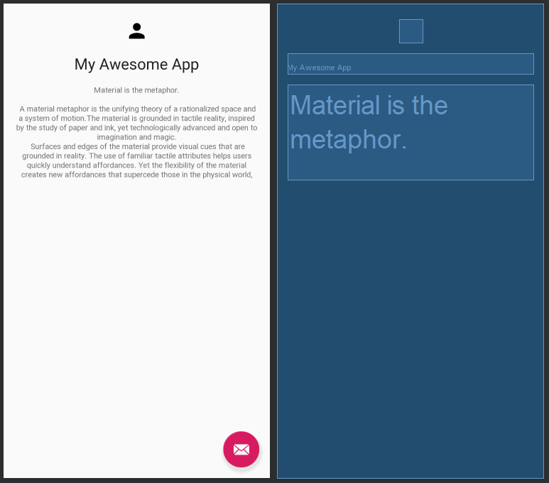
Hero transform is similar to Shared Element photo transition example discussed at the beginning of the article. The home layout defined below has app icon branding by using source bounds, we can have a hero animation and fade in the rest of the content(textViews).

Like material transform above, I will continue using TransitionManager to pull off the hero transition. The start state is similar and is left as an excercise for the reader.
End State
Defining end state is simple, we take advantage of ConstraintSet’s applyTo method and reapply the home screen constraints again which reverts the changes made by start state. Then the only remaining part is transition choreography. AutoTransition does not help here as it by default has a order (disappear, move, appear) and uses Fade for animating visibility.
Transition steps
- App icon hero transition: The icon moves from
sourceBoundslocation to its default location (center|top). ChangeBounds transition can help here andmoveResize {}is thetransition-xequivalent. To add material touch, we can set ArcMotion in the PathMotion property which curves the movement a bit. - Texts: The text items below simply change visibility. Slide is great for this and slides in content from bottom. By setting targets, we make slide only affect the texts.
- Background: The background color changes from
transparenttowhite. We can use ChangeColor included withtransition-xto animate the color changes.
Putting the above code together we have:
heroTransformRootLayout.prepareTransition {
    changeColor {
        +heroTransformContentLayout
    }
    slide {
        +heroTitle
        +heroContent
    }
    moveResize {
        pathMotion = ArcMotion()
    }
}
defaultHeroConstraints.applyTo(heroTransformContentLayout)
layoutDefaults()
The full code for the above can be found here:
Practical Example
The motivation for this article came from working on one of my side project app: T9 App Launcher. The app shows a dialog like screen to launch other apps with T9 Sequence. Since conceptually it is closely tied to the system launcher, it made sense to reduce the gap between the launcher and my app and seamless transition was one way. Currently the store version does the circular reveal transition:
Bonus
One another neat side effect of this implementation is custom launchers like Nova Launcher send the Source Bounds information for gestures too. I have configured T9 to launch whenver I swipe up on an empty space in my home screen and Nova Launcher sends the location where my finger was lifted up. This makes T9 launch from where I lifted my finger and becomes a cool effect.
Considerations
If your app launches any other app in some instance, then sending sourceBounds to that app can help. To do this, I have written a Kotlin extension that gives the sourceBounds from the clicked View just like Intent expects. Make your app a good Android citizen!
/**
 * Computes a [Rect] defining the location of this [View] in terms of screen coordinates
 *
 * Note: The view must be laid out before calling this else the returned [Rect] might not be valid
 */
private fun View.computeScreenBounds(): Rect {
    val viewLocation = IntArray(2).apply { getLocationOnScreen(this) }
    val contentX = viewLocation[0]
    val contentY = viewLocation[1]
    return Rect(
        contentX,
        contentY,
        contentX + width,
        contentY + height
    )
}

/**
 * Computes a [Rect] defining the location of this [View] and invokes [action] with the computed bounds when available
 */
fun View.screenBounds(action: (Rect) -> Unit) {
    if (!ViewCompat.isLaidOut(this) && !isLayoutRequested) {
        action(computeScreenBounds())
    } else {
        doOnNextLayout {
            action(computeScreenBounds())
        }
    }
}
Summary
In this article, sourceBounds from Intent was introduced and was explored in context of animations. Inferring home screen icon location for animations opens up new ways to innovatively welcome users on to your app. I believe small UX details like can help in differentiating your app. Although not a core focus, TransitionManager for choreographing perfomant animations was shown and it proves to be simpler and concise way to animate changes instead of dealing with many object animators. Using source bounds for entry animations can scale well in the future since the app only only relies on the location. For example, if Android OS is updated to include hardware button location when app is launched via button, then app automatically respects it and shows a nice animation originating from the hardware button.
The sample application source code can be found here.
Do you have any other idea for using sourceBounds or any feedback on the content? Please let me know in the comments below.
– Arun

Comments